Shannon Levin
14 Hands Red Blend packaging
packaging case study
14 Hands Winery, capitalizing on the success of Hot to Trot Red Blend, wanted to expand their portfolio into a higher priced Red Blend.
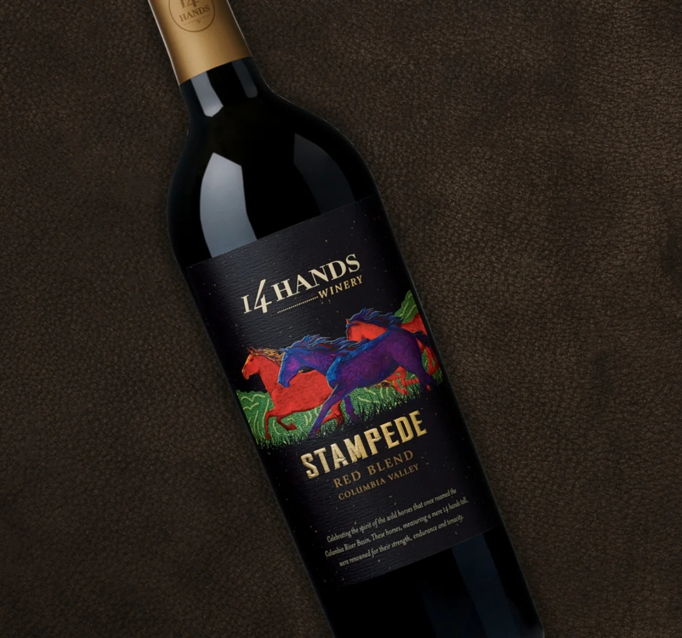
The directive was to create a more fun, appealing package at a higher price point than the existing Hot to Trot Red Blend. We were given freedom to explore the package but directed to keep the initial brand artwork.
The final design expanded out the initial artwork, creating a scene of running horses. Small foil flecks were added to the background, like dust clouds. The varietal was given a fun, descriptive name that was emphasized with a western style font in gold foil. The illustration is a sculpted emboss.
The projected cases on this project increased once the packaging was shared. After a successful launch, this product has grown year over year.
My role in this project was art direction and design.
After the success of Stampede…
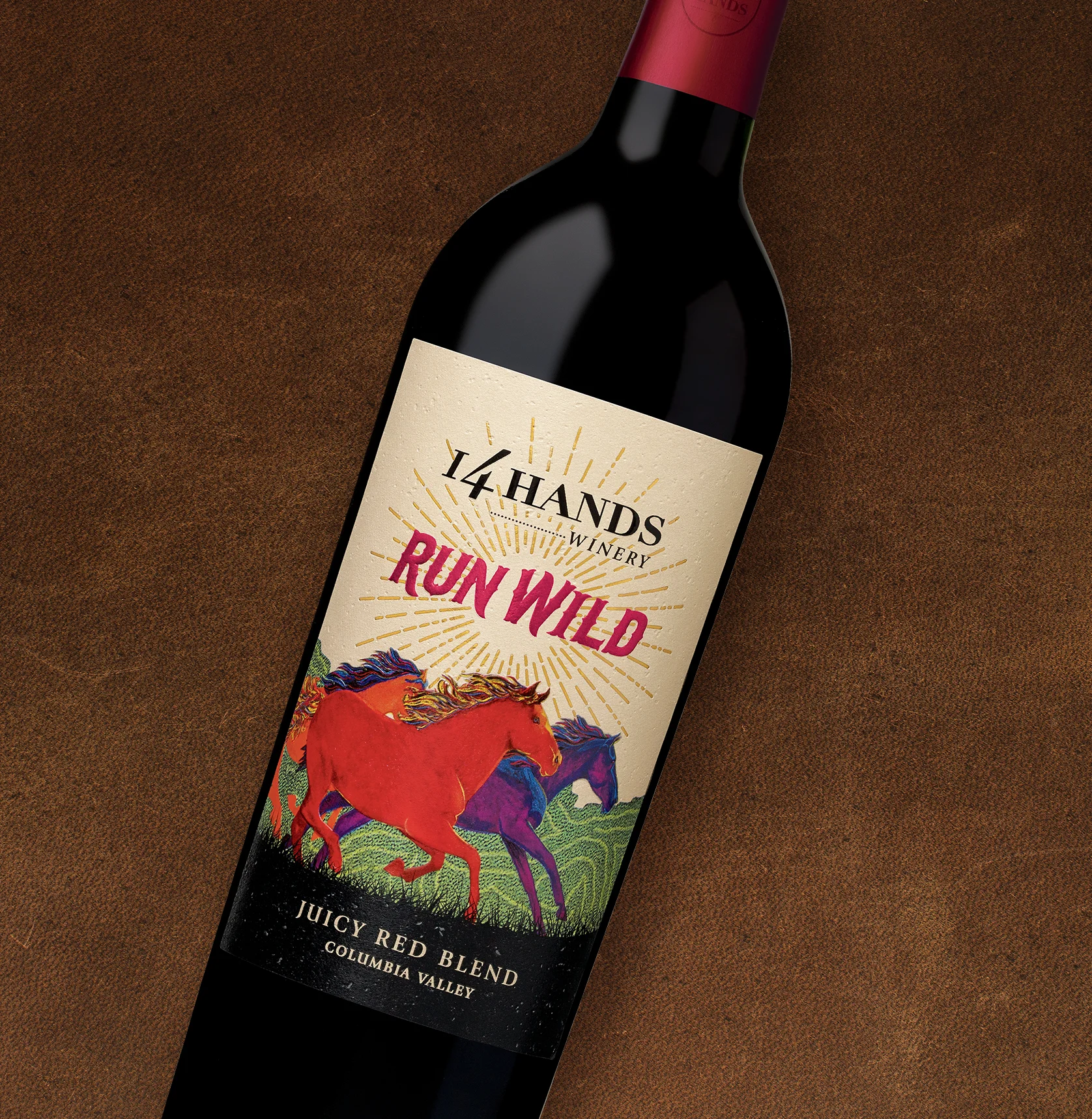
…we were once again rewarded with a sweeter style of Red Blend that needed a package, Run Wild. This product was little less expensive than Stampede, so we explored a more “daylight” version of the artwork and expanded the horses. A pop of red foil and gold rays add a fun element to this line extension. I led the creative for this project. For each of these examples, I was involved from the beginning to final completion, including art direction, design, press checks, creation of launch materials, POS, and photography direction.


